One of the most difficult aspects of designing for the mobile web is making your site compatible and accessible across different devices. A mobile-optimized site might look great on your iPhone or Android device, but utterly fall apart on Symbian or BlackBerry handsets. Likewise, a simple WAP-enabled site might be fine for feature phones, but fall short of expectations when it comes to newer and more advanced devices.
Today, we want to take a look at some specific tips and tricks for testing and adding compatibility for different types of devices.
1. Narrow Your Focus
It’s natural to want to make your site look absolutely perfect on every possible device that could access your mobile site. However, this just isn’t practical for the vast majority of developers and designers.
Instead of trying to support every platform out there, set out some goals for your site and your potential customers. For instance, if you know that most of your users are going to be using an iPhone, focus on making an iPhone-enhanced version of your site first.
Conversely, if you get a lot of traffic from parts of the world like Asia, the Middle East and South America, you may want to focus your primary efforts on Symbian.
It’s also important to remember that at this point, the vast majority of the next generation of mobile devices use the WebKit rendering engine for their web browsers. Nokia uses WebKit for its S40 and S60 built-in browsers, Apple uses it for Mobile Safari, Palm for webOS, Google for Android and the upcoming BlackBerry 6 will have a WebKit-based browser, too.
Just because they all use WebKit doesn’t mean that all devices will render content the same way, but it does give you a good baseline of what sort of browser engines should be tested and focused on.
2. Use an Emulator to Check Your Work
If you don’t have access to every major device type that you want to check, you can still get a good idea of how content will look on other devices by using mobile emulators.
Here are a few of our favorite tools:
- iBBDemo2 — This Adobe Air app will let you see content as it would appear on the iPad and on the iPhone. Support for Android is reportedly coming soon. The app is a bit slow but it does a good job showing accurate results for iOS devices. Just point the app towards your test mobile site.
- Android SDK — The Android SDK comes with its own device emulator so you can see how websites will appear on Android handsets. Check out these guides for installing the Android SDK on Mac or Windows.
- Blackberry Web Development Page — This page gives you access to the BlackBerry simulators and includes tips for designing for BlackBerry devices.
- Symbian S60 SDKs — Nokia’s site has information on the S60 platform and available emulators.
- Opera Mini Emulator — Opera has a desktop version of its mobile browser and lots of resources about designing for Opera Mobile across platforms.
3. Use Multiple Stylesheets for Device Support
Including a mobile-specific stylesheet on your main site with certain parameters that add or subtract features, based on what device is being used, can be an elegant and effective way to serve content across multiple devices.
Dominique Hazael-Massieux wrote a great article for A List Apart last year that covers some of the basics and also links to some of the most common parameters for handheld support.
Dave Shea included his own solution back in 2008 that is still pretty usable for lots of devices.
More recently, Chris Coyier at CSS-Tricks discussed how to add in screen size and browser support via CSS or jQuery, and he includes his own downloadable examples.
Dave Calhoun has some excellent suggestions in his series on mobile web development.
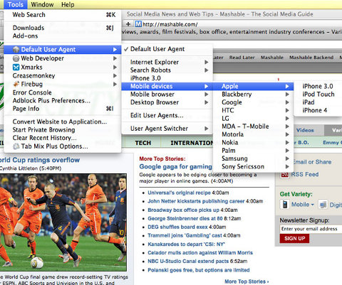
4. Change Your User Agent in Firefox or Safari
If you want to get on-the-fly feedback of how your site will look while testing in your web browser, just change your user agent. Each device carries a user agent string that can be used to tell web browsers what type of device it is.

Safari and Firefox both offer easy ways of changing your user agent so that you can get a glimpse at how content will look on other browsers. In Firefox, download Chris Pederick’s User Agent Switcher. To add more mobile browsers to the plugin, see this comment.
5. Use Your CMS
If you use a content management system like WordPress or Drupal for your site, your best bet might be to use a mobile plugin. WordPress, for example, has the popular WPtouch plugin. There are free and paid versions of the plugin and it works with a variety of devices and you can even specify which devices you want to use the mobile stylesheet and which devices you want to load the full page.
Meanwhile, Drupal also has lots of mobile plugins, including the aptly named, Mobile Plugin.
Final Notes
How do you cross test for mobile browsers? Let us know!
DO YOU NEED OUR HELP?
Contact our experts, most of the time we assist our readers free of charge.Those who found this page were searching for:
- how to test mobile web to nokia s40
- How to chang my symbian mobile platform
- webkit every major device
- bb emulator for symbian
- how to optimize opera mobile emulator to mobile web
- wordpress twentyeleven iphone
- optimize mobile web sites for symbian webkit
- s40 jquery mobile
- wap design multiple devices
- designing websites for multiple platforms